London Debuts the 2012 Olympic Logo

N&P: Discuss governments, nations, politics and recent related news here.

Moderators: Alyrium Denryle, Edi, K. A. Pital

Post Reply
User avatar
CaptainChewbacca
Browncoat Wookiee
Posts: 15746
Joined: 2003-05-06 02:36am
Location: Deep beneath Boatmurdered.

London Debuts the 2012 Olympic Logo

Post by CaptainChewbacca »

Link

Good lord, it looks like it was done by some twelve-year-old 1337 tagger. How much did they spend on this?
London unveils logo of 2012 Games

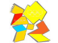
The logo for the 2012 Olympics and Paralympics has been unveiled in a star-studded ceremony in London.

The jagged emblem, based on the date 2012, comes in a series of shades of pink, blue, green and orange and will evolve in the run-up to the Games.

The word London and the Olympic rings are included in the first two digits of the new logo.

"This is the vision at the very heart of our brand," said London 2012 organising committee chairman Seb Coe.

"It will define the venues we build and the Games we hold and act as a reminder of our promise to use the Olympic spirit to inspire everyone and reach out to young people around the world.

"It is an invitation to take part and be involved.

"We will host a Games where everyone is invited to join in because they are inspired by the Games to either take part in the many sports, cultural, educational and community events leading up to 2012 or they will be inspired to achieve personal goals."

The new design, which cost £400,000, has received a mixed response, but Lord Coe was adamant it put across the image and message that he wanted the London Games to deliver to the world.

"It's not a logo, it's a brand that will take us forward for the next five years," he told BBC Five Live.

"It won't be to be eveybody's taste immediately but it's a brand that we genuinely believe can be a hard working brand which builds on pretty much everything we said in Singapore about reaching out and engaging young people, which is where our challenge is over the next five years.

"If we don't that, then frankly the whole project is unsustainable."

For the first time the same logo will be used for both the Olympic and Paralympic Games.

Organisers hope the brand will boost the marketing push to raise £2bn to stage the Games and convey the message that London 2012 will be "Everyone's Games".

Prime Minister Tony Blair said: "We want London 2012 not just to be about elite sporting success.

"When people see the new brand, we want them to be inspired to make a positive change in their life.

"London 2012 will be a great sporting summer but will also allow Britain to showcase itself to the world."

International Olympic Committee President Jacques Rogge said: "This is a truly innovative brand logo that graphically captures the essence of the London 2012 Olympic Games - namely to inspire young people around the world through sport and the Olympic values.

"Each edition of the Olympic Games brings its own flavour and touch to what is now well over a century of modern Olympic history; the brand launched today by London 2012 is, I believe, an early indication of the dynamism, modernity and inclusiveness with which London 2012 will leave its Olympic mark."

The brand, designed by Wolff Ollins, has been targeted at the young people the organisers hope will get involved.

It is a deliberate change from previous Olympic logos, which often feature an image from the city.

Olympics Minister Tessa Jowell said: "This is an iconic brand that sums up what London 2012 is all about - an inclusive, welcoming and diverse Games that involves the whole country.

"It takes our values to the world beyond our shores, acting both as an invitation and an inspiration.

"This is not just a marketing logo, but a symbol that will become familiar, instantly recognisable and associated with our Games in so many ways during the next five years."

British Paralympic Association chief executive Phil Lane believes that having one logo for both the Olympics and Paralympics is a positive move.

"As the founding nation for the Paralympic movement it is fitting that Britain should lead the way in integrating the two Games," he said.

"We hope that the brand will succeed in inspiring Britain's youth and Paralympic athletes to success."

Plans have also been drawn up to create a different logo for grassroots projects backing the Games.

It would not include the Olympic rings but would spread the benefits of hosting the Games to projects involved in its grassroots cultural, environmental and sporting work.

A London 2012 spokeswoman said: "It is not going to be a free for all. There would be conditions to qualify for it.

"It is not about giving it out to people so that they do not pay for it. It is about an emblem that could be a stamp of endorsement that really fits in with the legacy of the Games."

London Mayor Ken Livingstone added: "The new Olympic brand draws on what London has become - the world's most forward-looking and international city.

"That message of welcome and diversity was one of the main reasons for London's success in winning the Games.

"We offer the world the same exciting message that in 2012 every athlete and every visitor will feel at home in our city."
Stuart: The only problem is, I'm losing track of which universe I'm in.
You kinda look like Jesus. With a lightsaber.- Peregrin Toker
ImageImage
User avatar
Kuja
The Dark Messenger
Posts: 19322
Joined: 2002-07-11 12:05am
Location: AZ

Post by Kuja »

Image

Seizure, anyone?
Image
JADAFETWA
User avatar
Plekhanov
Sith Marauder
Posts: 3991
Joined: 2004-04-01 11:09pm
Location: Mercia

Post by Plekhanov »

When you realise that they somehow managed to spend £400,000 developing that atrocity you begin to understand why the budget for the Olympics is escalating so quickly.

It's a truly appalling logo, I can't remember the last time something like this was so universally loathed, I'm just astonished that that thing is the work of a professional and that it was the best/least bad option whoever approved it had.
User avatar
kheegster
Jedi Council Member
Posts: 2397
Joined: 2002-09-14 02:29am
Location: An oasis in the wastelands of NJ

Post by kheegster »

Image

Reminds me of this. Are the 2012 Olympics volunteers going to be wearing the logo on their lapels as well?
Articles, opinions and rants from an astrophysicist: Cosmic Journeys
User avatar
kheegster
Jedi Council Member
Posts: 2397
Joined: 2002-09-14 02:29am
Location: An oasis in the wastelands of NJ

Post by kheegster »

Ghetto edit:

Oh, and a suggestion for the mascot:

Image

Asbo the Chav
Articles, opinions and rants from an astrophysicist: Cosmic Journeys
User avatar
Plekhanov
Sith Marauder
Posts: 3991
Joined: 2004-04-01 11:09pm
Location: Mercia

Post by Plekhanov »

No wonder the petition to scrap it is up over 13,000 within hours of the logo going public.

going off topic slightly the following criticism of the choice of logo is one of the most pathetic attempts to blame 'political correctness' for everything I've seen in quite a while:
Tory MP Philip Davies, a member of the Commons Culture, Media and Sport Select Committee, said: "Bright pink is certainly not the colour I would have chosen to represent the United Kingdom.

"I suppose it sums up the politically-correct world that this Government appears to inhabit." Source
What the fuck has political correctness got to do with this?

In what way is bright pink 'politically-correct'? Not that it matters anyway as it's apparently designed with 'colour changing animation' in mind which still won't fix the main problem which is the ridiculous shape of the thing.
User avatar
Patrick Degan
Emperor's Hand
Posts: 14847
Joined: 2002-07-15 08:06am
Location: Orleanian in exile

Post by Patrick Degan »

Puke. And that's a professional opinion.
When ballots have fairly and constitutionally decided, there can be no successful appeal back to bullets.
—Abraham Lincoln

People pray so that God won't crush them like bugs.
—Dr. Gregory House

Oil an emergency?! It's about time, Brigadier, that the leaders of this planet of yours realised that to remain dependent upon a mineral slime simply doesn't make sense.
—The Doctor "Terror Of The Zygons" (1975)
User avatar
Temjin
Jedi Council Member
Posts: 1567
Joined: 2002-08-04 07:12pm
Location: Winnipeg, Manitoba, Canada

Post by Temjin »

Kuja wrote:Image

Seizure, anyone?
When I first saw the logo, it looked kinda... dirty to me. I couldn't figure out why though. Now I know! It's a girl feeling up another persons ass!

No really. The part where the five rings are is the girl's head, with a ponytail. Then the part under that, is the woman's body bending down. The square in the middle is the girl's hands. Then, the bottom left square is the secon person's legs. Above that is the torso, with the arms coming out of it, as if the person was holding the wall with his hands.

I guess this means London is going to be taking it up the ass in 2012.

That, or I just have a sick and Juvenile mind.
"A mind is like a parachute. It only works when it is open."
-Sir James Dewar

Life should have a soundtrack.
Pick
Sith Marauder
Posts: 3690
Joined: 2005-01-06 12:35am
Location: Oregon, the land of trees and rain!

Post by Pick »

This logo is AWFUL. I mean, REALLY. You can't even tell what it is.
"The rest of the poem plays upon that pun. On the contrary, says Catullus, although my verses are soft (molliculi ac parum pudici in line 8, reversing the play on words), they can arouse even limp old men. Should Furius and Aurelius have any remaining doubts about Catullus' virility, he offers to fuck them anally and orally to prove otherwise." - Catullus 16, Wikipedia
Image
User avatar
Battlehymn Republic
Jedi Council Member
Posts: 1827
Joined: 2004-10-27 01:34pm

Post by Battlehymn Republic »

Anyone got a screenshot of Clive Owen's character wearing a 2012 sweatshirt in Children of Men?
Jim Raynor
Sith Devotee
Posts: 2922
Joined: 2002-07-11 04:42am

Post by Jim Raynor »

I'm no graphic designer, but this logo clearly has several major problems with it:

1. What the fuck are these random shapes even supposed to be?

2. The colors, pink and bright yellow, are loud, unfashionable, and hard on the eyes.

3. The composition is garbage. The word "london" (they didn't even bother to capitalize it :roll: ) is small and off to one side, while the Olympics logo is the same way on the other side. Meanwhile, the entire bottom half of the logo is blank and completely pointless. The whole thing just doesn't look "together." Here's an example of a logo that doesn't completely suck ass. Notice the use of such complex concepts as "centering" and "symmetry."

Seriously, I think just about any one of us could have designed a better logo than that.
"They're not triangular, but they are more or less blade-shaped"- Thrawn McEwok on the shape of Bakura destroyers

"Lovely. It's known as impugning character regarding statement of professional qualifications' in the legal world"- Karen Traviss, crying libel because I said that no soldier she interviewed would claim that he can take on billion-to-one odds

"I've already laid out rules for this thread that we're not going to make these evidential demands"- Dark Moose on supporting your claims
User avatar
Hawkwings
Sith Devotee
Posts: 3372
Joined: 2005-01-28 09:30pm
Location: USC, LA, CA

Post by Hawkwings »

Temjin wrote:
Kuja wrote:Image

Seizure, anyone?
When I first saw the logo, it looked kinda... dirty to me. I couldn't figure out why though. Now I know! It's a girl feeling up another persons ass!

No really. The part where the five rings are is the girl's head, with a ponytail. Then the part under that, is the woman's body bending down. The square in the middle is the girl's hands. Then, the bottom left square is the secon person's legs. Above that is the torso, with the arms coming out of it, as if the person was holding the wall with his hands.

I guess this means London is going to be taking it up the ass in 2012.

That, or I just have a sick and Juvenile mind.
Looked more like the girl blowing a guy to me.

I seriously hope that they change it, and fast too. I mean, pull some random guy off the street, pay him £400,000, and I guarantee he'll do better than this steaming pile of seizure-inducing crap.
User avatar
Shroom Man 777
FUCKING DICK-STABBER!
Posts: 21222
Joined: 2003-05-11 08:39am
Location: Bleeding breasts and stabbing dicks since 2003
Contact:

Post by Shroom Man 777 »

Schutzstaffel, Deutchsland Uber Alles!
Image "DO YOU WORSHIP HOMOSEXUALS?" - Curtis Saxton (source)
shroom is a lovely boy and i wont hear a bad word against him - LUSY-CHAN!
Shit! Man, I didn't think of that! It took Shroom to properly interpret the screams of dying people :D - PeZook
Shroom, I read out the stuff you write about us. You are an endless supply of morale down here. :p - an OWS street medic
Pink Sugar Heart Attack!
User avatar
CaptainChewbacca
Browncoat Wookiee
Posts: 15746
Joined: 2003-05-06 02:36am
Location: Deep beneath Boatmurdered.

Post by CaptainChewbacca »

Jim Raynor wrote:I'm no graphic designer, but this logo clearly has several major problems with it:

1. What the fuck are these random shapes even supposed to be?
It is a stylized/hip-hop numeral 2012. 20/12 is how its split up. Abysmal, I agree.
Stuart: The only problem is, I'm losing track of which universe I'm in.
You kinda look like Jesus. With a lightsaber.- Peregrin Toker
ImageImage
User avatar
Sriad
Sith Devotee
Posts: 3028
Joined: 2002-12-02 09:59pm
Location: Colorado

Post by Sriad »

I'm a fan of the goatse alt-logo. (SFW BTW.)

http://www.youtube.com/watch?v=2W_gInR3gXs
User avatar
Winston Blake
Sith Devotee
Posts: 2529
Joined: 2004-03-26 01:58am
Location: Australia

Post by Winston Blake »

I hope this thing isn't like a Rorschach test:

Image
User avatar
Sriad
Sith Devotee
Posts: 3028
Joined: 2002-12-02 09:59pm
Location: Colorado

Post by Sriad »

Simple yet unmistakable:

Image
User avatar
Big Orange
Emperor's Hand
Posts: 7108
Joined: 2006-04-22 05:15pm
Location: Britain

Post by Big Orange »

kheegster wrote:Image

Reminds me of this. Are the 2012 Olympics volunteers going to be wearing the logo on their lapels as well?
The SS emblem is far more aesthetically pleasing than that pile of crappy purple cubes that is supposedly going to represent the London 2012 Olympics - the SS logo is a much better brand, despite it's sinister connections and the same goes for the Nazi German flag...
User avatar
Big Orange
Emperor's Hand
Posts: 7108
Joined: 2006-04-22 05:15pm
Location: Britain

Post by Big Orange »

Sriad wrote:Simple yet unmistakable:

Image
Apart from the sketched in blowjob the blue background, white outlines and more neutral purple the improves the logo somewhat - I expected an abstract logo for London 2012, but nothing that looks like wine vomit…
Psychic_Sandwich
Padawan Learner
Posts: 416
Joined: 2007-03-12 12:19pm

Post by Psychic_Sandwich »

It'd be interesting to get inside the mind of the designer of this monstrosity, and find out why he thought an image of Lisa Simpson giving head was a good idea...
User avatar
Dartzap
Sith Acolyte
Posts: 5969
Joined: 2002-09-05 09:56am
Location: Britain, Britain, Britain: Land Of Rain
Contact:

Post by Dartzap »

And this why you should not have Tory peers looking over the shoulders of designers, although I think Coe thinks its a pile of bollocks as well, considering his fake grin at the revealing yesterday.
EBC: Northeners, Huh! What are they good for?! Absolutely nothing! :P

Cybertron, Justice league...MM, HAB SDN City Watch: Sergeant Detritus

Days Unstabbed, Unabused, Unassualted and Unwavedatwithabutchersknife: 0
User avatar
Big Orange
Emperor's Hand
Posts: 7108
Joined: 2006-04-22 05:15pm
Location: Britain

Post by Big Orange »

I'm more sickened by the amount of money wasted on such a scrappy logo - remember about seven to nine years ago when British Airways wanted to add colour to the tail wings of their passanger planes? That was a waste of money and publicity flop as well...
User avatar
Hillary
Jedi Master
Posts: 1261
Joined: 2005-06-29 11:31am
Location: Londinium

Post by Hillary »

Mind you, olympic logos seem to be a bit shit generally.
Here are a selection of other recent efforts.


Image
What is WRONG with you people
Teebs
Jedi Master
Posts: 1090
Joined: 2006-11-18 10:55am
Location: Europe

Post by Teebs »

Big Orange wrote:I'm more sickened by the amount of money wasted on such a scrappy logo - remember about seven to nine years ago when British Airways wanted to add colour to the tail wings of their passanger planes? That was a waste of money and publicity flop as well...
I agree it was a waste, but at least British Airways wasn't using taxpayer's money to do it.
User avatar
Jon
Jedi Council Member
Posts: 1501
Joined: 2004-03-02 10:11am
Location: Manchester UK

Post by Jon »

As soon as this was unveiled this was the first thing that entered my head too.

Image

Image

It is a bit of a joke really, for £400,000.
Post Reply