
So, these are simple Gouache on Vellum-style paper, some with highlights from Gold Paint pens (because it's easier than gold leaf).


Moderator: Beowulf


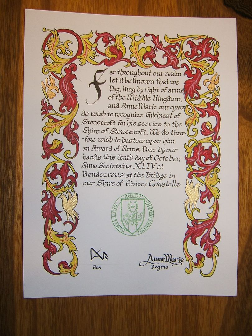
Oh, there's plenty of room for all the fancy calligraphy on every scroll, since they're on 9x12 vellum-style art paper. The white border around each scroll is exactly 1inch indentation per side, which puts them all in proper perspective:Thanas wrote:What I like about 5&7 is their elegant simplicity. They leave enough space so I can see huge, lovely gold-patterned medieval letters on the white space. I have a bit of trouble seeing that with #4.

It is not a space issue, it is a perspective issue. #4 will have the natural focus of the eye on the fancy stuff at the side. At this point the side show becomes center stage, which is a bit unbecoming.LadyTevar wrote:Oh, there's plenty of room for all the fancy calligraphy on every scroll, since they're on 9x12 vellum-style art paper. The white border around each scroll is exactly 1inch indentation per side, which puts them all in proper perspective:Thanas wrote:What I like about 5&7 is their elegant simplicity. They leave enough space so I can see huge, lovely gold-patterned medieval letters on the white space. I have a bit of trouble seeing that with #4.
It would all depend on the scibal hand used. This isn't going to be Book of Kells large-size gold-leaf calligraphy; that would be better suited to the swans. The huge vine is better suited to Carolingian miniscule, a more flowing style to match the vinework.Thanas wrote: It is not a space issue, it is a perspective issue. #4 will have the natural focus of the eye on the fancy stuff at the side. At this point the side show becomes center stage, which is a bit unbecoming.