Page 2 of 3
Re: Critique Thread (56k unfriendly)
Posted: 2010-07-03 03:38am
by The Grim Squeaker
J:
You might want to try shooting at a better time of day, that'll help with the background being so blown out while letting you retain the lovely "haze" around the dandylions.
Here's an idea - try shooting through a very fine stocking placed over the lense. It'll give a nice gauze and soft focus effect, that combined with a less glaring background could help greatly. (And it's cheaper than a ND filter

)
Re: Critique Thread (56k unfriendly)
Posted: 2010-07-04 05:54am
by Marcus Aurelius
The Grim Squeaker wrote:J:
Here's an idea - try shooting through a very fine stocking placed over the lense. It'll give a nice gauze and soft focus effect, that combined with a less glaring background could help greatly. (And it's cheaper than a ND filter

)
That's a very nice sounding trick. I will try it, too, thanks for the tip.
I still don't see what an actual ND filter would help, though. I (circular) polarizer on the other hand, if you can use one, could help with the blown out sky.
Re: Critique Thread (56k unfriendly)
Posted: 2010-07-04 06:18am
by The Grim Squeaker
Marcus Aurelius wrote:The Grim Squeaker wrote:J:
Here's an idea - try shooting through a very fine stocking placed over the lense. It'll give a nice gauze and soft focus effect, that combined with a less glaring background could help greatly. (And it's cheaper than a ND filter

)
That's a very nice sounding trick. I will try it, too, thanks for the tip.
No prob. I only tried it once in a nude photography shoot, so I can't make any guarantees on it's application in other..venues

Marcus Aurelius wrote:
I still don't see what an actual ND filter would help, though. I (circular) polarizer on the other hand, if you can use one, could help with the blown out sky.
You can hold the filter so that it'll only cover part of the lens. Say, the top third wherein lies the sky

Re: Critique Thread (56k unfriendly)
Posted: 2010-07-04 06:55am
by Marcus Aurelius
The Grim Squeaker wrote:
Marcus Aurelius wrote:
I still don't see what an actual ND filter would help, though. I (circular) polarizer on the other hand, if you can use one, could help with the blown out sky.
You can hold the filter so that it'll only cover part of the lens. Say, the top third wherein lies the sky

Yes, of course! Now excuse me, I will have to break out the whip for some self-flagellation

Re: Critique Thread (56k unfriendly)
Posted: 2010-07-05 07:17am
by The Grim Squeaker
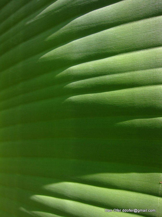
Texture practice:

A bit flat despite morning light and simplicity. Maybe a different angle? different plant(s)?
Re: Critique Thread (56k unfriendly)
Posted: 2010-07-09 02:20pm
by Bounty
It feels very broken up. I'm not a fan of textures-as-a-subject at the best of times but you might want to pick a subject where the eye is drawn towards the texture rather than having different tones and shadows in there that make you think you're missing the big picture; either that or shoot from farther away to put a nicely textured item against a neutral background.

Re: Critique Thread (56k unfriendly)
Posted: 2010-07-09 08:38pm
by salm
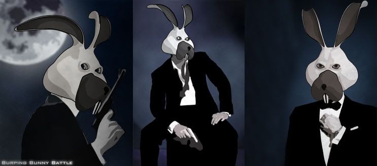
A gaming character i´m working on at the moment. The head is a 3D model rendered with a cel shader while the rest is modified photos and other stuff pixeled together in Photoshop. This guy will be used mainly for the cutscenes which won´t be animated and will consist of stills with overlayed text.

Re: Critique Thread (56k unfriendly)
Posted: 2010-07-09 08:53pm
by salm
@Bounty: I think the image buildup is pretty good but it lacks a big dark, heavy element contrasting the bright things. Maye you could make that big tree darker.
Re: Critique Thread (56k unfriendly)
Posted: 2010-07-10 02:07am
by The Grim Squeaker
The shades of "brightness" on the face are very stark, and a bit overly contrasty (dark/light diff). Unless that's an intentional stylistic choice to make it look cell shaded?
Looks good. (Although the teeth/nose are a bit large - it makes it look a bit odd vis a vis the proportions of the rest of the face).
Good stuff!
Re: Critique Thread (56k unfriendly)
Posted: 2010-07-14 06:15am
by The Grim Squeaker
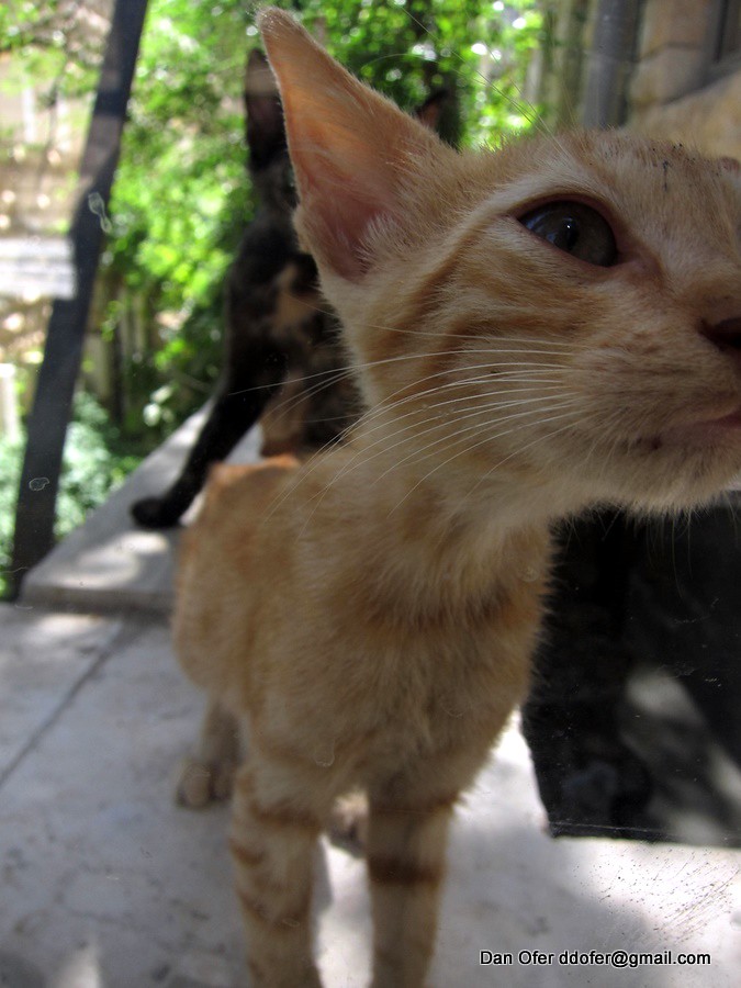
Sniff at glass

Yes, a sterotypical "Animal sniffs up close at the camera, look how big and cute it's head is!". Still, I ended up liking this picture most on the purely visceral level out of the pictures I took of a family of baby kittens this morning with my compact.
The eye is in excellent focus, and the bokeh while unpleasant includes the rest of said kit's family.
Animal picture tips that really work: Get close. Get low. Manual exposure is essential, cameras fail badly at metering of dark coloured animals.
Re: Critique Thread (56k unfriendly)
Posted: 2010-07-15 11:35am
by Fingolfin_Noldor
The Grim Squeaker wrote:Texture practice:

A bit flat despite morning light and simplicity. Maybe a different angle? different plant(s)?
Seems.. rather blurred (maybe even noisy)? Or out of focus?
Re: Critique Thread (56k unfriendly)
Posted: 2010-07-15 01:19pm
by The Grim Squeaker
Nope. You're just not used to seeing the fibers of the plant

Re: Critique Thread (56k unfriendly)
Posted: 2010-07-25 09:15pm
by Phantasee
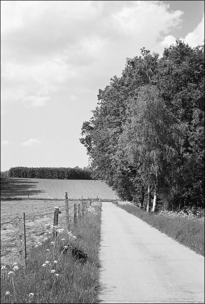
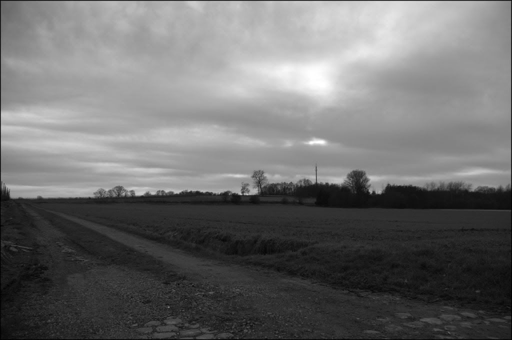
There's something about that shot I like, with the path leading off. I get the feeling that the left side is safety or freedom, but there's something on the right, past the tree, that I need to see.
I wonder if seeing the right side would make the image safe and boring, and hiding it makes it interesting? I tried flipping the image around, as well, and it didn't have the same feeling. I wonder how much of that is because I'm right handed.
Re: Critique Thread (56k unfriendly)
Posted: 2010-07-28 03:27am
by The Grim Squeaker
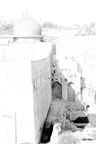
Yes, I freely admit to being inspired by a far greater photographer than myself in this overexposure. Thoughts?
IMG_0125

Re: Critique Thread (56k unfriendly)
Posted: 2010-08-03 02:16pm
by Bounty
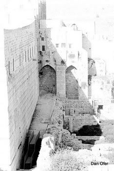
It's so overexposed you lose any sense of what it's supposed to display. The right two-thirds, from the courtyard onwards, actually make for a very nice picture, but the large blob of bright white on the left drowns it out completely.

This isn't a perfect crop, obviously, but shows what I'd have done with the original. I do like the shadow you've got going on there.
Re: Critique Thread (56k unfriendly)
Posted: 2010-08-25 02:14pm
by darthdavid

Trying my hand at some HDR...
Re: Critique Thread (56k unfriendly)
Posted: 2010-08-27 03:27pm
by Marcus Aurelius
darthdavid wrote:
Trying my hand at some HDR...
Is the owl deliberately out of focus? If it is, it's certainly non-conventional, but I'm sorry, I can't really see the idea.
About the HDR part of it: I'm not a huge fan of HDR and don't know too much about it, but it appears to me that the sky is still a bit overexposed, which to my knowledge is something HDR is supposed to avoid.
Re: Critique Thread (56k unfriendly)
Posted: 2010-09-04 09:20pm
by phongn
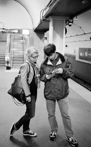
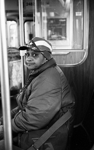
Couple scenes from public transit - go go EI 1600:


Re: Critique Thread (56k unfriendly)
Posted: 2010-09-11 03:16pm
by Bounty
Really like the first photo of the couple, but the second one I think has too much dead space on the right. I realise you can't always help this, and you did nail the expression, but if you cropped this afterwards it may be something to play around with on the original.

Re: Critique Thread (56k unfriendly)
Posted: 2010-10-18 10:19pm
by Simplicius
The Grim Squeaker wrote:Yes, I freely admit to being inspired by a far greater photographer than myself in this overexposure. Thoughts?
Though I'm a bit late here, I'd suggest trying to even out your highlights and shadows as much as possible when you make the frame (get bracketed exposures if need be) and doing the compositing and overexsposure in post. Where there aren't large bold shadows and bright areas that give a graphical effect, the appearance is vaguely of a pencil sketch. In this case, though, you're unable to render the whole of the subject because you lost parts of it in the direct sun, where a pencil artist would keep on sketching.
Long story short, this is the kind of shot you want to obtain raw material for in the field but realize in the digital darkroom because of the control it gives you over the final result.
Other long story preemptively shortened: 'Effect' shots like this are usually best employed in support of a concept. There's nothing wrong with just dicking around, but as a photographic tool it's not of much use until employed with a purpose (and, I would say, in a cohesive body of work instead of a one-off).
Re: Critique Thread (56k unfriendly)
Posted: 2010-11-14 04:47pm
by The Grim Squeaker
 IMG_0484
 by
Dan Ofer, on Flickr
Poyke!
I managed to avoid melting my lens hood.
Re: Critique Thread (56k unfriendly)
Posted: 2011-01-05 07:35am
by The Grim Squeaker
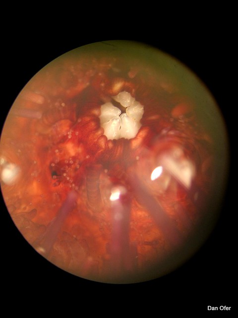
Binocular shot of a Sea Urchin.
Blasted stupid lack of macro on my camera. And focusing down the eye piece tube is a bitch.
 IMG_0021
 by
Dan Ofer, on Flickr
Sea Urchin blow up.
(Sample of the lighting I built up on it
here: )
Re: Critique Thread (56k unfriendly)
Posted: 2011-02-09 03:33pm
by Bounty
Re: Critique Thread (56k unfriendly)
Posted: 2011-03-12 03:10pm
by The Grim Squeaker
Cat and mouse.
Always have a camera handy, even in the computer math lab!
 IMG_0015
 by
Dan Ofer, on Flickr
Re: Critique Thread (56k unfriendly)
Posted: 2011-06-04 04:28am
by Phantasee
I've received a lot of positive responses to this photo, but I'm not sure why it's good. I'm happy with the colours, and that it came out as well as it did, considering I just ran out to the lake behind my house (stormwater overflow, really) around sunset. If you look closely you can see the streetlights and the outlines of houses.

 )
)