So, just looking for some critical feed back... improvements, likes, dislikes needs more detail etc. Obviously, it needs ink.
Oh yeah, had to scan it in two pieces so that is why it is all dark in the center.

Moderator: Beowulf


I didn't have any trouble with this, considering A) There's no background detail other than the moon, and B) There's the moon.Ford Prefect wrote:As usual, the art is very good. I like the flow in the first six panels, as the individual 'snapshots' fit together well. The second last and last panels don't seem to flow all that well. I'm still not sure exactly what's going on in the second to last panel. Are we looking up from the street or down on his passing shadow? That probably needs to be more explicit, if possible (I imagine that colouring would help). If it's the former, then perhaps having him pass over the moon would help.


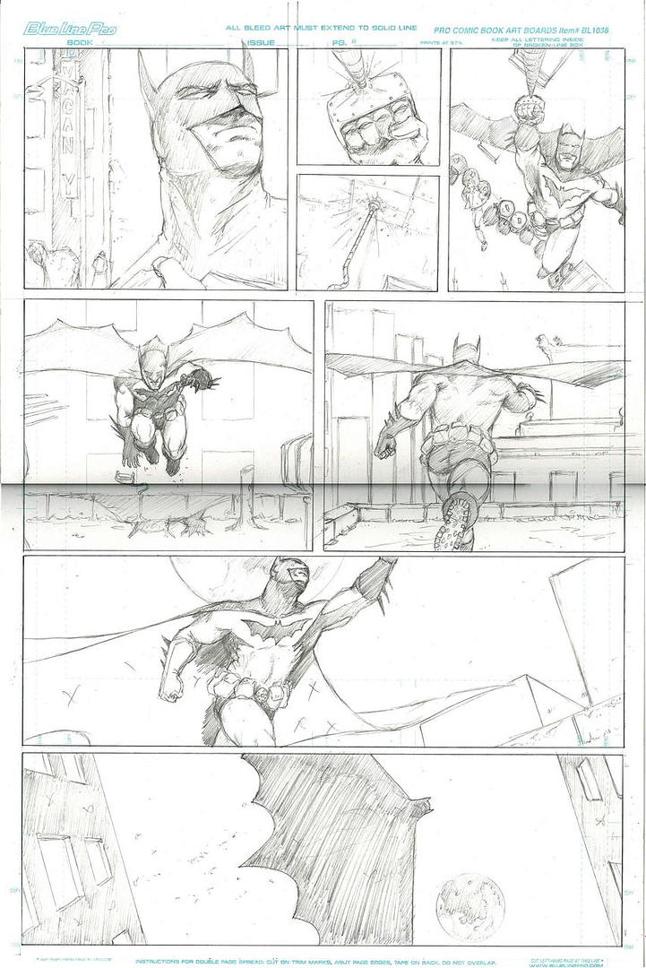
Up from the street. I sort of assumed the moon gave it away. Perhaps my moon drawing skills need work. Does it look like a pizza on the street?Ford Prefect wrote: I like the flow in the first six panels, as the individual 'snapshots' fit together well. The second last and last panels don't seem to flow all that well. I'm still not sure exactly what's going on in the second to last panel. Are we looking up from the street or down on his passing shadow?
I like that one as well.The last panel is the best in terms of composition.
It is a lot of space, but it is intentional. I will elaborate further when I post the rest, but I am hoping it will be clear through just the art.but it seems like a lot of space to devote to Batman jumping off a building, though the fact it is standalone (I presume) means that it's not so important.
I wasn't aware of that at all actually, so thank you for that. I will keep it in mind. It did seem redundant as I was drawing it as well. Like I said, not very good at the story boarding. If you have any other tips like this that you might think I would find helpful please feel free to let them flow.Kanastrous wrote:My only quibble would be with the compositions in frames five and six - Batman running towards, and then away from our POV in-frame. In film this is what we'd call 'breaking the 180 degree rule,' with which you are probably already familiar. It's not a hard-and-fast rule (few are) but I'd suggest altering the axis of view from one to the other, or perhaps including something in the background of the second frame as a reveal or as a destination, to sort of make the second frame pop on its own in relation to the first.
I'll keep that in mind.Just as an aside, I'll point out that if you decide to cultivate your storyboarding-related skills, professional storyboard artists can make insane $$$ in the entertainment industry...
That's what I was thinking.Joviwan wrote:I didn't have any trouble with this, considering A) There's no background detail other than the moon, and B) There's the moon.
I see what your saying. I'm not sure how I could add to it without it seeming cluttered.Overall though, there is a bit of a disconnect (or redundancy?) between the last and second to last panels. Everything else is clearly 1 frame per action, and you've given 2 to flying across two rooftops.
That does look better as a stand alone page, but with the next page, it throws it off. It also puts two panels with him running in it next to each other, which I wouldn't have done.Rye wrote:I don't think your 180 rule breaking is too bad in the middle; but I would swap the last two pictures over. That way, the reader gets the impression of a zooming out motion (rather than repeating action), which is better to ending the page on.
I'll try that with my next storyboard.I know what you mean when you say that drawing storyboards is a tedious ballache. As it is, I tend to write scripts as economical yet visually descriptive as I can and then the storyboards are obvious as a consequence.
That looks good. As for Batman's body in that last shot, he is in the shadow of his cape. The outline was just for me to make sure that everything was the right size. I'll make the opening in his mask visible so it will add some perspective.Joviwan wrote:had a minute free at work, thought I'd show what rye's suggestion looked like
*snip* image
I will say though, that while I didn't have an issue with the moon shot, it you gave batman's body a more prominent outline, it would reduce confusion significantly; as it is, you have to look for it pretty carefully, which gives the impression that, at least for batman, we're looking top down.
This is just me being stupid because of how it's just a the shadow of his cape. In retrospect it is actually obvious that we're looking up, and that the idea that there was some sort of ... reflected moon is silly.Havok wrote:Up from the street. I sort of assumed the moon gave it away. Perhaps my moon drawing skills need work. Does it look like a pizza on the street?I will do his face so that you can understand the angle better.


This is good BTW. Thank you.Kanastrous wrote:No, it's not the least bit confusing to follow

I'm curious.or what is being said/thought in the panels I will post that.

Will that make me a millionaire?JointStrikeFighter wrote:Try not to draw any feet next time. The bad guy's gun needs a square barrel too, possibly several.