The Aesthetics of Abramstrek

FAN: Discuss various fictional worlds that don't qualify for SF.

Moderator: Steve

Post Reply
User avatar
Zor
Sith Acolyte
Posts: 5927
Joined: 2004-06-08 03:37am

The Aesthetics of Abramstrek

Post by Zor »

Abramstrek is something that is controversial and a fair number of people don't like it. I agree with them on some issues relating to story, tone and worldbuilding and I will say that Into Darkness is bad and Star Trek 2009 is on balance on the better side of "it's fine". Even so there is one point that which I find to be just plain bad, namely most of the complaints about the aesthetics of it.

We'll start with a major point: Aesthetic preferences are subjective. Some like Baroque, others Bauhaus. I am not here to mandate your visual preferences. What I am interested in is less "does this thing look nice?" (though for most of the Starfleet Stuff I say Yes) and more "do these designs fit into Star Trek?" to which my response is "Hell Yes".

The most obvious point is the Uniforms, the clothes that our heroes wear when they are boldly going, the thing that makes a photograph of William Shatner, Leonard Nimoy or Simon Pegg be a picture of Kirk, Spock or Scotty. Here we have the TOS Uniform...
Image
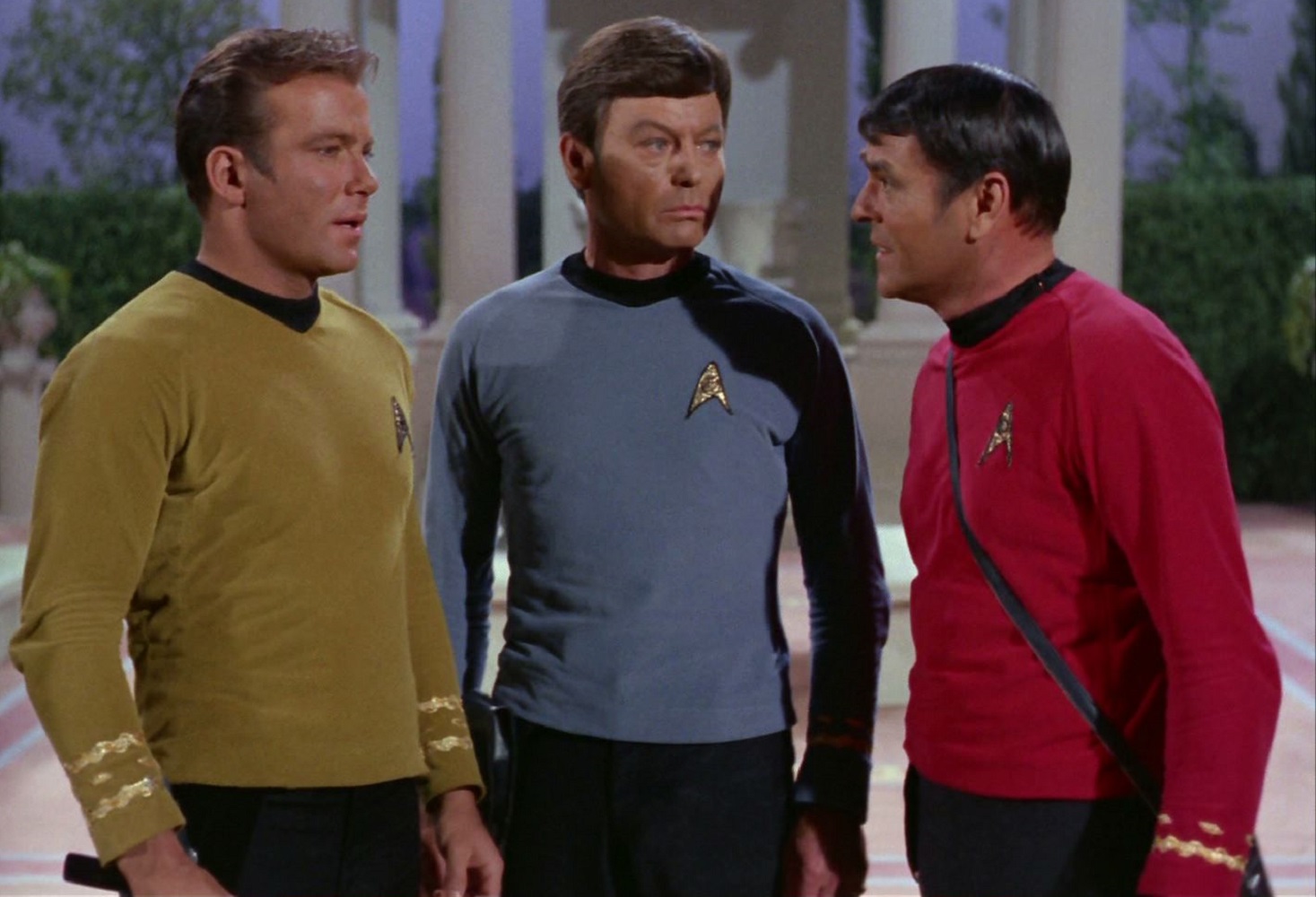
...While the TOS Uniform was made on the cheap, there is a design philosophy behind it. Simple in form (Shirt, Pants, Boots) made with synthetic fabrics, easy and comfortable to wear, color coded for departments, nice and orderly without being overtly militaristic. Ideas that were common enough of sci-fi of that era.

Now compare that to Abrams Trek uniforms.
Image
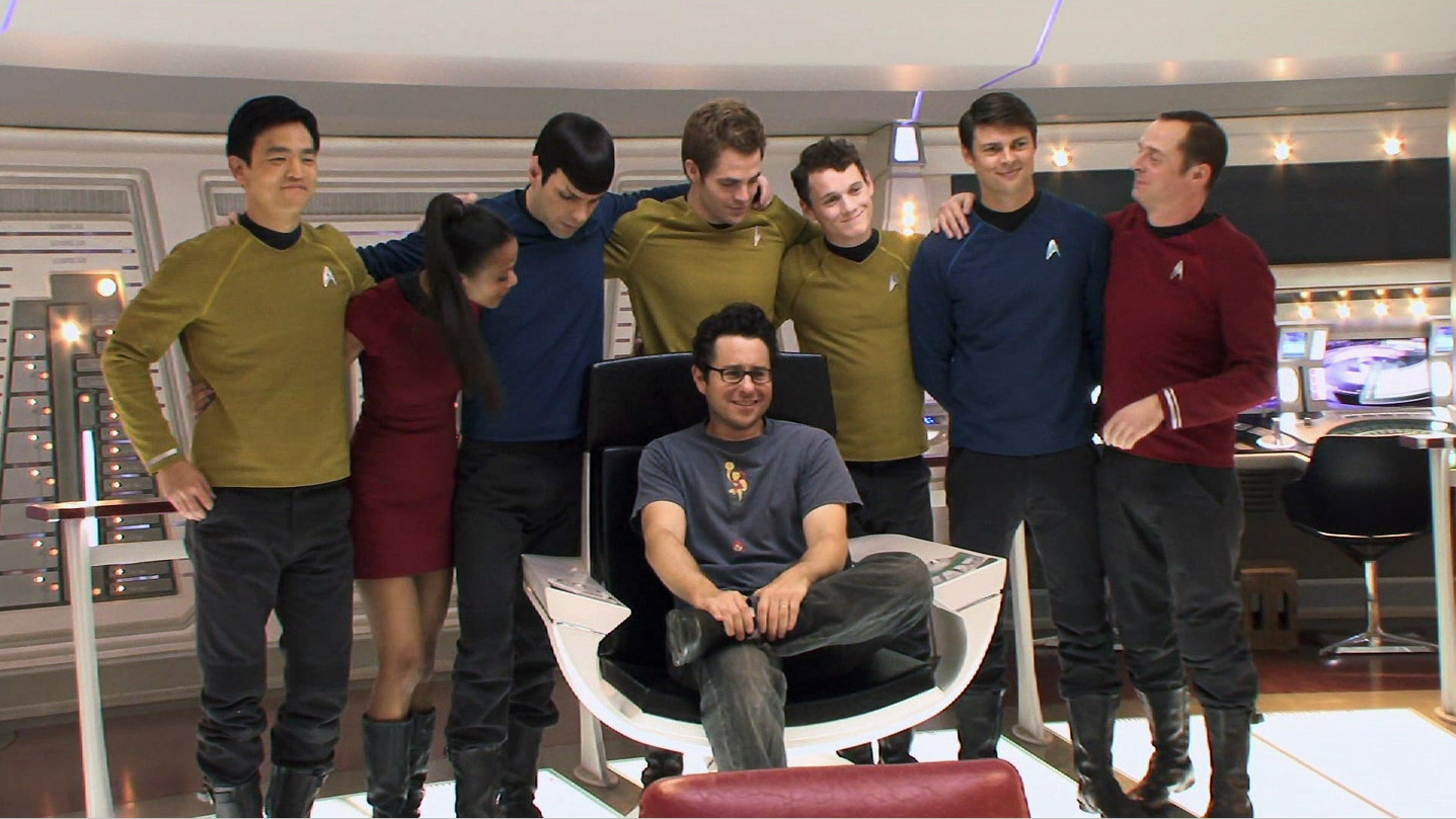
They're the same basic idea but with better execution. Better tailoring, better textiles and the rough edges dealt with. It's distinctively and iconically Trek.

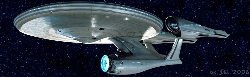
Same basic principle applies to the Enteprise.
Image

Then there is the the Mac Store vibe that some people felt was really bad. I never got it and frankly felt that it fit in quite well. First of all, all Trek series have been influenced aesthetically by what was conceived of as looking High Tech at the Time as a visual shorthand to tell you that this is more modern. But secondly there are some specifics which come back around. The Apple Aesthetic is based off old school modernist designs, a big part of the modernist movement was imagining a future in which technologies such as mass production had make a better world. That's the Star Trek ethos in design form and moreover there were elements of 1960s Modernism which were incorporated into TOS's designs. Sure both were shaped by the ideas of 1960s and the Obama Administration respectively, but both start from the same basic place as far as design philosophy. Please note that I got this when I first saw the trailers.

And lastly I would like to say "If Not this, then what?" There is probably out there in the lands of the hypothetical a million ways of going about this which would be just as good if not better for this specific franchise, but unless you have a book full of concept art for "My Version of a Star Trek soft Reboot trilogy of Films" lying about it's rather hard to prove that your preferred version is better. That said, recreating the look of the Original Series bolt for bolt would have been on par with making everyone wear Mayopants, pants made of mayonnaise. It worked reasonably well in the shows as a throwback but frankly you're kidding yourself if you'd think that anyone but the hardest of hardcore oldschool trekkies would have thought that recreating the TOS Bridge for Abramstrek would have been a good idea.

In summery as far as aesthetics go, Abramstrek did a damn fine job. The worst you can say is that it was a product of it's time and even then it holds up pretty well.

Zor
HAIL ZOR! WE'LL BLOW UP THE OCEAN!
Heros of Cybertron-HAB-Keeper of the Vicious pit of Allosauruses-King Leighton-I, United Kingdom of Zoria: SD.net World/Tsar Mikhail-I of the Red Tsardom: SD.net Kingdoms
WHEN ALL HELL BREAKS LOOSE ON EARTH, ALL EARTH BREAKS LOOSE ON HELL
Terran Sphere
The Art of Zor
User avatar
The Romulan Republic
Emperor's Hand
Posts: 21559
Joined: 2008-10-15 01:37am

Re: The Aesthetics of Abramstrek

Post by The Romulan Republic »

Yeah, Abrams Trek isn't that bad visually, though keeping the TOS-style mini-skirts is... a look that has not aged well.
"I know its easy to be defeatist here because nothing has seemingly reigned Trump in so far. But I will say this: every asshole succeeds until finally, they don't. Again, 18 months before he resigned, Nixon had a sky-high approval rating of 67%. Harvey Weinstein was winning Oscars until one day, he definitely wasn't."-John Oliver

"The greatest enemy of a good plan is the dream of a perfect plan."-General Von Clauswitz, describing my opinion of Bernie or Busters and third partiers in a nutshell.

I SUPPORT A NATIONAL GENERAL STRIKE TO REMOVE TRUMP FROM OFFICE.
User avatar
Eternal_Freedom
Castellan
Posts: 10369
Joined: 2010-03-09 02:16pm
Location: CIC, Battlestar Temeraire

Re: The Aesthetics of Abramstrek

Post by Eternal_Freedom »

This is pretty much what I just said in your other thread about Vulcan ships. Yeah, the Abrams films looked like Star Trek, they did an excellent job - I particularly liked the greater variety we saw in Starfleet vessel design, even if only briefly. As with Enterprise though, visual design, costumes etc aren't enough to make up for deficiencies in other, vital areas.
Baltar: "I don't want to miss a moment of the last Battlestar's destruction!"
Centurion: "Sir, I really think you should look at the other Battlestar."
Baltar: "What are you babbling about other...it's impossible!"
Centurion: "No. It is a Battlestar."

Corrax Entry 7:17: So you walk eternally through the shadow realms, standing against evil where all others falter. May your thirst for retribution never quench, may the blood on your sword never dry, and may we never need you again.
Crazedwraith
Emperor's Hand
Posts: 11871
Joined: 2003-04-10 03:45pm
Location: Cheshire, England

Re: The Aesthetics of Abramstrek

Post by Crazedwraith »

Shouldn't this be in PST?

And I'll say this for the JJPrise, I hated it in still shots and am still not fond of it but in motion in the films, it looks a heck of lot better.

As for what else could be done. Well your beloved Star Trek: Enterprise shows the original design works perfectly well in CGI and Discovery has an updated and modern put much closer to the original design which looks great as well. (Dsc's fed ships all look pretty decent, shame the same can't be said for the klingon anything)
Post Reply