If you have an artwork you want serious opinions about, or you are trying to learn and you want helpful feedback, this is a thread devoted to critique.
Like Show-Off, this is a multi-media thread. We've got a spread of people on this board with experience in a variety of different arts, so if you draw, render, photograph, compose, make movies, and so on, there should be at least one person able to offer a considered opinion. Don't be dissuaded just because there are a lot of people taking photographs.
Sometimes the opinions may not be the ones you were hoping to hear, but that is part of the process. You won't get shit on, but you may be told you've got a lot to learn. If you just want to show off your stuff and get compliments/casual comments, post here instead.
Rules
1. Limit yourself to one artwork per day, and give people a chance to respond instead of posting one per day every day like clockwork. The purpose is to solicit opinions, not show off.
2. If you post things to be critiqued, you must give critique. Mutual helpfulness is the purpose of the thread. If a person repeatedly posts without critiquing in return, his or her artwork will be barred from the Critique Thread until he/she is forthcoming with critiques.
3. Avoid chattiness and low-effort critiques. Don't give empty compliments ("Nice colors," "Cool," "It sucks," "Boring," "You win xXx~*Super Best Artist Award*~xXx plz comment!" etc.). Good critique is reasoned opinion; opinions offered without reasoning belong in the Show-off Thread and will be moved there.
4. Respect the effort of critiquers, and only post work that you've put some effort and thought into. Be prepared to answer questions as well as ask them.
5. If a lot of people are commenting on one work, and you don't have anything to say that hasn't already been said, maybe give your attention to a more neglected work.
6. Images bigger than 1000 pixels on the longest side must be linked or thumbnailed. Images that don't comply will be de-inlined.
7. If it is not safe for work, tag it and link it.
Critique Thread (56k unfriendly)
Moderator: Beowulf
-
Simplicius
- Jedi Council Member
- Posts: 2031
- Joined: 2006-01-27 06:07pm
-
The Grim Squeaker

- Emperor's Hand
- Posts: 10319
- Joined: 2005-06-01 01:44am
- Location: A different time-space Continuum
- Contact:
Re: Critique Thread (56k unfriendly)
What's the policy on posting in both threads?
Say I post 3 pictures in the casual thread and one of them here?
Say I post 3 pictures in the casual thread and one of them here?
Photography
Genius is always allowed some leeway, once the hammer has been pried from its hands and the blood has been cleaned up.
To improve is to change; to be perfect is to change often.
Genius is always allowed some leeway, once the hammer has been pried from its hands and the blood has been cleaned up.
To improve is to change; to be perfect is to change often.
-
The Grim Squeaker
- Emperor's Hand
- Posts: 10319
- Joined: 2005-06-01 01:44am
- Location: A different time-space Continuum
- Contact:
Re: Critique Thread (56k unfriendly)
Fire.
Photography
Genius is always allowed some leeway, once the hammer has been pried from its hands and the blood has been cleaned up.
To improve is to change; to be perfect is to change often.
Genius is always allowed some leeway, once the hammer has been pried from its hands and the blood has been cleaned up.
To improve is to change; to be perfect is to change often.
-
Simplicius
- Jedi Council Member
- Posts: 2031
- Joined: 2006-01-27 06:07pm
Re: Critique Thread (56k unfriendly)
That's fine, if the one you're posting here is one you really want to be critiqued. Don't just march every single photo through here albeit one at a time, though, because that's not the point. It's a resource, not a showcase.The Grim Squeaker wrote:What's the policy on posting in both threads?
Say I post 3 pictures in the casual thread and one of them here?
E1: It's totally cool to post something that got a good response in Show-Off if one wants to hear some more elaborate opinions.
E2: You won't be posting one a day, every day anyway unless you do a correspondingly large amount of critique. Rule 2.
-
J

- Kaye Elle Emenopey
- Posts: 5861
- Joined: 2002-12-14 02:23pm
Re: Critique Thread (56k unfriendly)
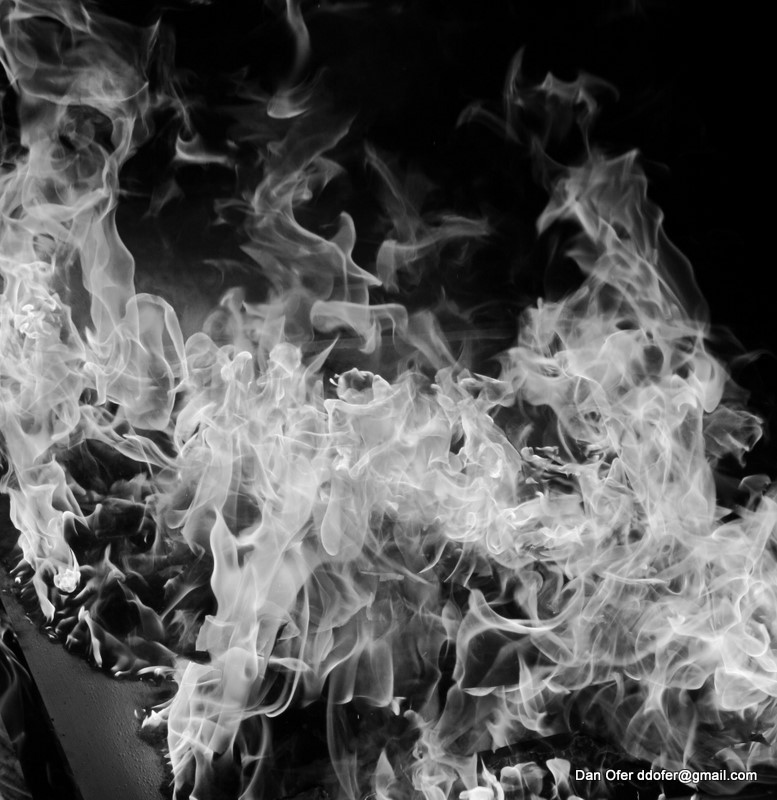
It's an interesting idea, however, I think it loses much of its effect in B&W since the lack of colour mushes things together. The central part looks too crowded & busy, the flames are too tight & overlapping so it's hard to tell what they are. I think it would work better if you zoomed in on the upper portions of the fire where there's larger individual sheets of flame so it doesn't get too distracting. Also, instead of a puddle of fuel, try using a line of fuel to reduce the overlap & clutter, or maybe time the shot so you get it just as the fuel goes "foof" to keep the flames simpler.The Grim Squeaker wrote:Fire.
Giant bronze light fixture

This post is a 100% natural organic product.
The slight variations in spelling and grammar enhance its individual character and beauty and in no way are to be considered flaws or defects
I'm not sure why people choose 'To Love is to Bury' as their wedding song...It's about a murder-suicide
- Margo Timmins
When it becomes serious, you have to lie
- Jean-Claude Juncker
-
Simplicius
- Jedi Council Member
- Posts: 2031
- Joined: 2006-01-27 06:07pm
Re: Critique Thread (56k unfriendly)
I think the choice of black and white adds at least one thing - I think the fine details of the massed flames through the center would not be as easily seen in color. The big splash of orange would grab most if not all of the attention directed at the photo.Death wrote:Fire
That said, the choice of black and white takes an awful lot away, i.e. a big splash of orange that is a surefire (heh) attention-getter. Quite frankly, from the perspective of your audience I don't see much reason to look at this photo. It is, as J said, rather cluttered, which I think detracts from its quality as a formal study of flame. The composition is incidental, not integral - it is short on visual cues, leaving the viewer mystified as to why you might have taking a picture of flames, and why this picture of flames as opposed to any other. There is no point of focus to find, no visual pathway to follow, and not much in terms of geometrical arrangement either. The photo has no depth - start to look into it and bang! there's the subject, and as it turns out any given part of the subject looks pretty much the same as any other part. The photo, in short, doesn't give a viewer any reason to want to keep looking at it, which is pretty much the opposite of what any good photograph is supposed to do.
It's worth noting that you took something, the appeal of which lies in its warmth, its color, and its motion, and made a photo that removed all these things. Congratulations?
-
Simplicius
- Jedi Council Member
- Posts: 2031
- Joined: 2006-01-27 06:07pm
Re: Critique Thread (56k unfriendly)
I can't help but look at this one in terms of architecture, and for that reason I think the diagonal composition does more harm than good. It removes the kind of formal presentation you might expect (formal as in form, but also formal as in Serious Business - this is a bank after all) but doesn't exactly replace it with anything equally substantive. There's also the problem that since that fixture isn't abstracted, one can clearly see the direction that down ought to be, and think "Whoops, there's some skewed perspective" without really having an answer as to why.J wrote:Fixture
-
J
- Kaye Elle Emenopey
- Posts: 5861
- Joined: 2002-12-14 02:23pm
Re: Critique Thread (56k unfriendly)
The goal, which I admit wasn't realized, was to balance the electrolier against the thingy at the top from which it hangs, and to get the line between the light fixture and its fancy anchor thingy to mirror the ones formed by the coffers on the roof. I did take pictures from various angles including straight on formal shots but I found those to be boring. The other thing is that yes, it's a bank, but Commerce Court North is modelled on the Baths of Caracalla so I didn't want a straight formal photo. A Bath is not serious business, even if it's really a bank which looks like a bath.
Question: what if you didn't look at the photo in terms of architecture? Does that change anything?
Question: what if you didn't look at the photo in terms of architecture? Does that change anything?
This post is a 100% natural organic product.
The slight variations in spelling and grammar enhance its individual character and beauty and in no way are to be considered flaws or defects
I'm not sure why people choose 'To Love is to Bury' as their wedding song...It's about a murder-suicide
- Margo Timmins
When it becomes serious, you have to lie
- Jean-Claude Juncker
The slight variations in spelling and grammar enhance its individual character and beauty and in no way are to be considered flaws or defects
I'm not sure why people choose 'To Love is to Bury' as their wedding song...It's about a murder-suicide
- Margo Timmins
When it becomes serious, you have to lie
- Jean-Claude Juncker
-
phongn

- Rebel Leader
- Posts: 18487
- Joined: 2002-07-03 11:11pm
Re: Critique Thread (56k unfriendly)
From a non-architecture perspective - it looks like there are two competing subjects. I'm not sure what to focus on. The colors of the light fixture stand out and I'm not quite sure if it's in a good way. The slightly curving field in the background is a bit distracting the more I look at it and the cutout at the bottom-right does nothing for me.J wrote:Fixture
For me, at least, the most interesting part is the text and the circle its inlaid in (along with the core decoration).
-
Zor

- Sith Acolyte
- Posts: 5928
- Joined: 2004-06-08 03:37am
Re: Critique Thread (56k unfriendly)

An alien lifeform i deisgned called the Greater Striped Wretch.
HAIL ZOR! WE'LL BLOW UP THE OCEAN!
Heros of Cybertron-HAB-Keeper of the Vicious pit of Allosauruses-King Leighton-I, United Kingdom of Zoria: SD.net World/Tsar Mikhail-I of the Red Tsardom: SD.net Kingdoms
WHEN ALL HELL BREAKS LOOSE ON EARTH, ALL EARTH BREAKS LOOSE ON HELL
Terran Sphere
The Art of Zor
Heros of Cybertron-HAB-Keeper of the Vicious pit of Allosauruses-King Leighton-I, United Kingdom of Zoria: SD.net World/Tsar Mikhail-I of the Red Tsardom: SD.net Kingdoms
WHEN ALL HELL BREAKS LOOSE ON EARTH, ALL EARTH BREAKS LOOSE ON HELL
Terran Sphere
The Art of Zor
-
Simplicius
- Jedi Council Member
- Posts: 2031
- Joined: 2006-01-27 06:07pm
Re: Critique Thread (56k unfriendly)
I'd have to echo phongn, really - the electrolier (big dark spot on a lighter field) and its mounting point + the ceiling around it (pattern, text) compete for attention a bit too much. Just looking at it, my focus jumps between them but never really settles on anything.J wrote:Question: what if you didn't look at the photo in terms of architecture? Does that change anything?
If you put some space between the fixture and the ceiling - force the perspective some more if possible, or use a shallower depth of field - you could draw attention to one part, but the result might not be the photo you were trying to make.
-
Simplicius
- Jedi Council Member
- Posts: 2031
- Joined: 2006-01-27 06:07pm
Re: Critique Thread (56k unfriendly)
Drawing's not my strong suit, but there is a lot that this one needs:Zor wrote:creature
1. Clean up your lines. You've got stray bits of limbs that you didn't erase, and the rest are sketchy.
2. Learn to shade and texture. Your line drawings don't give any real impression of shape or bulk, and when you're drawing weird-ass made-up animals that stuff is really important because no-one but you knows what's going on in your imagination.
3. Learn perspective. You've got limbs and shit going every which way and it's not at all clear where they all belong. Does the animal have three legs on one side and none on the other? Is one wing a tiny stub and the other one fuck-huge?
4. Learn anatomy. Seriously. What's the bone structure of this thing? Its musculature? You have to define the basic structure of the creature before you draw it.
3. Learn to pose. Is the creature supposed to be dangerous or timid? Agile or plodding? There's no way for anyone but you to know unless you use lifelike poses in your drawings. Right now it looks like its panhandling - is that your intent?
I would like to see at least token effort along these lines on the next drawing you post in here.
-
The Grim Squeaker
- Emperor's Hand
- Posts: 10319
- Joined: 2005-06-01 01:44am
- Location: A different time-space Continuum
- Contact:
Re: Critique Thread (56k unfriendly)
Re:Fixture -
There's a distinct lack of a definite focal point, there are multiple elements (the fixture itself, the inscriptions, the piece of wall jutting out in the corner, the green ceiling texture) with the viewer's eyes jumping between them.
A closer shot might have made this more grabbing (closer to just the ornament and it's inscription), while leaving the perspective (read: Wide or telephoto) up to you.
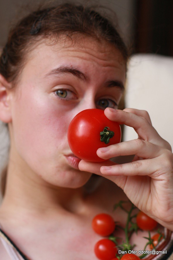
Portrait I made out of a set, Tomatoesfor Eyes(not sure if it's the best, but I greatly enjoyed coming up with and implementing the idea. Even if this specific shot doesn't actually have tomatoes for eyes. I mainly ended up modeling myself ):
):
Tomatoes 19-06-2010 17-21-02
There's a distinct lack of a definite focal point, there are multiple elements (the fixture itself, the inscriptions, the piece of wall jutting out in the corner, the green ceiling texture) with the viewer's eyes jumping between them.
A closer shot might have made this more grabbing (closer to just the ornament and it's inscription), while leaving the perspective (read: Wide or telephoto) up to you.
Portrait I made out of a set, Tomatoesfor Eyes(not sure if it's the best, but I greatly enjoyed coming up with and implementing the idea. Even if this specific shot doesn't actually have tomatoes for eyes. I mainly ended up modeling myself
Tomatoes 19-06-2010 17-21-02
Photography
Genius is always allowed some leeway, once the hammer has been pried from its hands and the blood has been cleaned up.
To improve is to change; to be perfect is to change often.
Genius is always allowed some leeway, once the hammer has been pried from its hands and the blood has been cleaned up.
To improve is to change; to be perfect is to change often.
-
salm

- Rabid Monkey
- Posts: 10296
- Joined: 2002-09-09 08:25pm
Re: Critique Thread (56k unfriendly)
If you´re going to do these modelling shots you should get rid of pimples and other stuff in her face. That´s a pretty easy PS job.
I also think you should probably turn down the blues a bit and perhaps the reds a tiny bit as well.
I also think you should probably turn down the blues a bit and perhaps the reds a tiny bit as well.
-
Marcus Aurelius
- Jedi Master
- Posts: 1361
- Joined: 2008-09-14 02:36pm
- Location: Finland
Re: Critique Thread (56k unfriendly)
I don't think the idea is so much about traditional modeling even if it's clearly posed. The idea is a bit goofy and I can imagine it was good fun to make that picture, but it isn't delivered fully to the viewer. I am not very good at giving advice with portrait and similar people pictures, being the fat nerd that I am, so I can't really tell what should be done to improve it. Perhaps if you could make it less goofy some way. More serious, I mean. I you look at fashion photography, they often do crazy things completely serious, and I think for a reason.salm wrote:If you´re going to do these modelling shots you should get rid of pimples and other stuff in her face. That´s a pretty easy PS job.
I also think you should probably turn down the blues a bit and perhaps the reds a tiny bit as well.
-
Jeremy

- Jedi Master
- Posts: 1132
- Joined: 2003-04-30 06:47pm
- Location: Hyrule
Re: Critique Thread (56k unfriendly)
The Grim Squeaker, I like the photo and the model choice was good. I think you could bill some of these shots for advertisements aimed at real people. This tomato one could be marketed to people who want to grow their own food. You might want to get the tomatoes off of her breast though. Israel (guessing that's your location) might not be as conservative as I thought though.
Girl with glasses
Women can see what they look like in glasses, not a photoshop perfected model.
BTW, this is disturbing.
Girl with glasses
Women can see what they look like in glasses, not a photoshop perfected model.
BTW, this is disturbing.
• Only the dead have seen the end of war.
• "The only really bright side to come out of all this has to be Dino-rides in Hell." ~ Ilya Muromets
• "The only really bright side to come out of all this has to be Dino-rides in Hell." ~ Ilya Muromets
-
The Grim Squeaker
- Emperor's Hand
- Posts: 10319
- Joined: 2005-06-01 01:44am
- Location: A different time-space Continuum
- Contact:
Re: Critique Thread (56k unfriendly)
Israel is waaaay more liberal than the US. Even more liberal than CaliforniaJeremy wrote:The Grim Squeaker, I like the photo and the model choice was good. I think you could bill some of these shots for advertisements aimed at real people. This tomato one could be marketed to people who want to grow their own food. You might want to get the tomatoes off of her breast though. Israel (guessing that's your location) might not be as conservative as I thought though.
Photography
Genius is always allowed some leeway, once the hammer has been pried from its hands and the blood has been cleaned up.
To improve is to change; to be perfect is to change often.
Genius is always allowed some leeway, once the hammer has been pried from its hands and the blood has been cleaned up.
To improve is to change; to be perfect is to change often.
-
The Grim Squeaker
- Emperor's Hand
- Posts: 10319
- Joined: 2005-06-01 01:44am
- Location: A different time-space Continuum
- Contact:
Re: Critique Thread (56k unfriendly)
Hehe. Love that shotJeremy wrote: BTW, this is disturbing.
Photography
Genius is always allowed some leeway, once the hammer has been pried from its hands and the blood has been cleaned up.
To improve is to change; to be perfect is to change often.
Genius is always allowed some leeway, once the hammer has been pried from its hands and the blood has been cleaned up.
To improve is to change; to be perfect is to change often.
-
Phantasee

- Was mich nicht umbringt, macht mich stärker.
- Posts: 5777
- Joined: 2004-02-26 09:44pm
Re: Critique Thread (56k unfriendly)
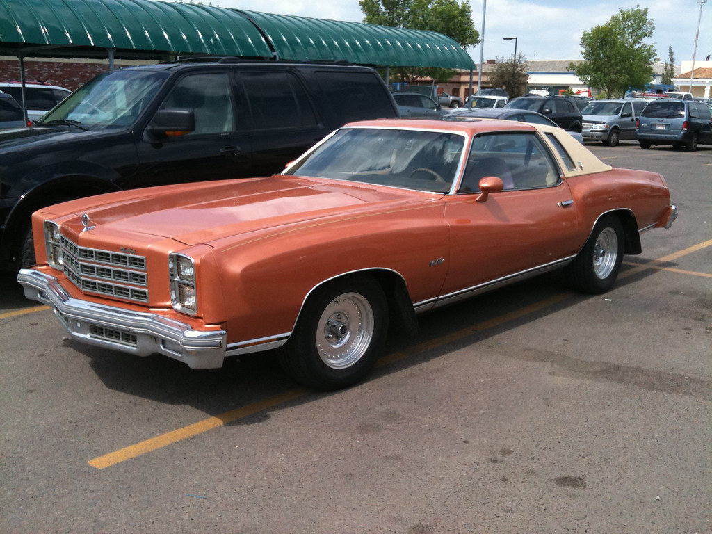
Saw this Monte Carlo at the supermarket by my house when I went to pick up some BBQ stuff. Other than the gorgeous subject, what do you think?
∞
XXXI
-
phongn
- Rebel Leader
- Posts: 18487
- Joined: 2002-07-03 11:11pm
Re: Critique Thread (56k unfriendly)
The black SUV in the background helps focus one on your subject - it works well. But otherwise - it's just sort of a boring image, to be honest. That front end is imposing - perhaps get in tighter with perspective distortion to show off its power? Was there anything nearby to sort of imply that this mighty steed is in its natural habitat?
-
J
- Kaye Elle Emenopey
- Posts: 5861
- Joined: 2002-12-14 02:23pm
Re: Critique Thread (56k unfriendly)
This one's been annoying me for a while, when I'm there it looks like such a great subject yet every time I take a photo it goes flat.
I could use some suggestions on how to make this thing look good.

I could use some suggestions on how to make this thing look good.
This post is a 100% natural organic product.
The slight variations in spelling and grammar enhance its individual character and beauty and in no way are to be considered flaws or defects
I'm not sure why people choose 'To Love is to Bury' as their wedding song...It's about a murder-suicide
- Margo Timmins
When it becomes serious, you have to lie
- Jean-Claude Juncker
The slight variations in spelling and grammar enhance its individual character and beauty and in no way are to be considered flaws or defects
I'm not sure why people choose 'To Love is to Bury' as their wedding song...It's about a murder-suicide
- Margo Timmins
When it becomes serious, you have to lie
- Jean-Claude Juncker
-
Phantasee
- Was mich nicht umbringt, macht mich stärker.
- Posts: 5777
- Joined: 2004-02-26 09:44pm
Re: Critique Thread (56k unfriendly)
Do you mean like a step or two to the left, crouch down a bit, for the perspective? I thought about it after the fact, but I was in a rush to get home at the time.phongn wrote:The black SUV in the background helps focus one on your subject - it works well. But otherwise - it's just sort of a boring image, to be honest. That front end is imposing - perhaps get in tighter with perspective distortion to show off its power? Was there anything nearby to sort of imply that this mighty steed is in its natural habitat?
As for the surroundings, alas, it was just another suburban supermarket parking lot.
I appreciate your advice. I realize the subject isn't super exciting, but knowing the black SUV was a plus helps. I was concerned it looked a little...dirty? Or busy.
∞
XXXI
-
phongn
- Rebel Leader
- Posts: 18487
- Joined: 2002-07-03 11:11pm
Re: Critique Thread (56k unfriendly)
Yeah. Muck around with perspective - or get right up front and shoot your camera's lens as wide as it'll go. Play around.Phantasee wrote:Do you mean like a step or two to the left, crouch down a bit, for the perspective? I thought about it after the fact, but I was in a rush to get home at the time.
The untinted/covered glass is kind of busy but the rest of the black sort of draws the color of the foreground subject into focus. The rest of the scene is also a bit busy but there may not be much you can do.I appreciate your advice. I realize the subject isn't super exciting, but knowing the black SUV was a plus helps. I was concerned it looked a little...dirty? Or busy.
Well, for one - you might be getting perspective compression depending how far away from it you are. That'll flatten the image. Two, the detail is being washed out of the thing. Finally, you might want to try using ND filters or something to reduce the depth of field.J wrote:This one's been annoying me for a while, when I'm there it looks like such a great subject yet every time I take a photo it goes flat.
I could use some suggestions on how to make this thing look good.
-
Marcus Aurelius
- Jedi Master
- Posts: 1361
- Joined: 2008-09-14 02:36pm
- Location: Finland
Re: Critique Thread (56k unfriendly)
Changing the perspective is always a good idea to try, as well trying something else than eye height if possible, but I would also like to know what is the natural color of that thing and if that could improve the shot. If it's rusted you might try cranking up the saturation for some Ken Rockwell candy colors. It works surprisingly well with man made objects, although I still can't stand his nature shots.phongn wrote: Well, for one - you might be getting perspective compression depending how far away from it you are. That'll flatten the image. Two, the detail is being washed out of the thing. Finally, you might want to try using ND filters or something to reduce the depth of field.
As for ND filters; why would you need those? I don't know what kind of camera J uses, but you would only need an ND filter if the camera is not capable of fast enough shutter speed and the lens actually has large enough aperture (not f-number but physical aperture) to reduce the depth of field. If she shoots with a small sensor digital compact, it's not going to help no matter how many ND filters she uses (of course most compacts don't even have filter threads, but NDs can be used by just holding them in front of the lens).
-
Phantasee
- Was mich nicht umbringt, macht mich stärker.
- Posts: 5777
- Joined: 2004-02-26 09:44pm
Re: Critique Thread (56k unfriendly)
I'm just shooting with an iPhone, so not much fiddling with lenses for me 
What you see is pretty much what was there, that colour was a little more vibrant in my memory but from what I've seen, the iPhone camera doesn't do much to the colour. It's pretty much WYSIWYG.
What you see is pretty much what was there, that colour was a little more vibrant in my memory but from what I've seen, the iPhone camera doesn't do much to the colour. It's pretty much WYSIWYG.
∞
XXXI